
Heatmap of Kelp Selection Overlap
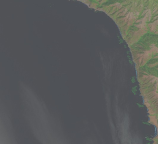
A lot of what we’ll be working on to determine area of beds are heatmaps of users selecting a pixel as kelp. This sounds somewhat abstract, so I wanted to operationalize it for you with some images. Let’s start with a single image from Floating Forests chosen because it has been flagged as having kelp. It has 13 classifications, so, one more and it is ‘complete’ – unless we decide to lower the classification threshold. The image is
So, what would it look like if we overlaid all of the outlines of users outlining kelp from the other day on the image?
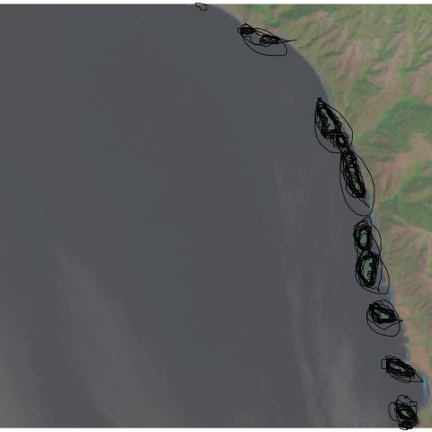
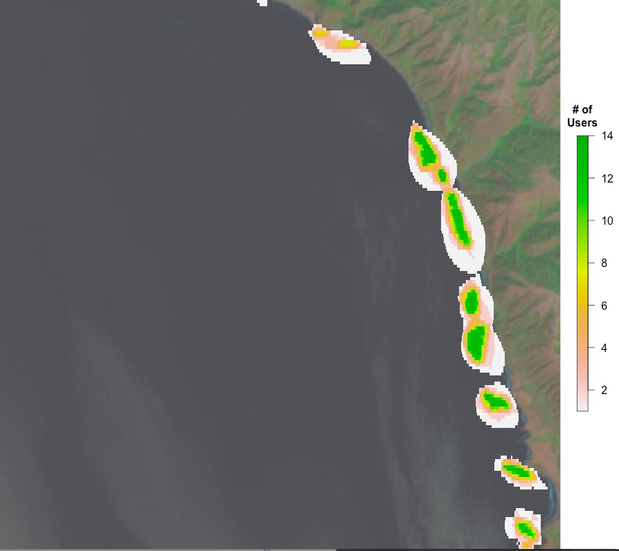
You can see, to some extent, folk circling the same areas, and their varying degrees of specificity. What does this result in if we want a heatmap of number of users selecting each pixel on which to do our analysis? Well, here you go!
Next time, a more quantitative look.
Recent Comments
| jebyrnes on Does Citizen Science Consensus… | |
| padibby on Does Citizen Science Consensus… | |
| zuzayshish on Kelpy Consensus | |
| jebyrnes on Kelpy Consensus | |
| zuzayshish on Kelpy Consensus |

Trackbacks / Pingbacks