
Kelp Forest Heatmap: Nightvision Edition
It’s been a bit since I promised calibration info, but we’ve hit a minor (almost solved) projection issue in comparing our data to some gold-standard data we have. So, to stave off boredom while the real geographers on our team do the heavy lifting, I’ve been futzing about with making the generation of overall indices easier. I arrived at a neat solution using Spatial Grids in R that was much faster than switching back and forth between rasters. The biggest bonus is that the default plotting of results with color as number of people selecting an area is *purty!*
Or at least, I think so.
How does this kelp forest look to you?

2 Million Kelp Classifications at Floating Forests!
Well, I woke up this morning, fired up Floating Forests, as is my wont, and saw this! I thought it would be a few more days, and was even going to post some exhortation, but you guys have been too awesome and brought us to 2 million classifications yourself!
DAMN!
Nice work, all! And now it looks like we’re going to need to throw some new regions your way soon!
Heatmap of Kelp Selection Overlap
A lot of what we’ll be working on to determine area of beds are heatmaps of users selecting a pixel as kelp. This sounds somewhat abstract, so I wanted to operationalize it for you with some images. Let’s start with a single image from Floating Forests chosen because it has been flagged as having kelp. It has 13 classifications, so, one more and it is ‘complete’ – unless we decide to lower the classification threshold. The image is
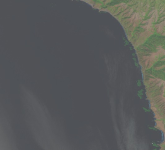
So, what would it look like if we overlaid all of the outlines of users outlining kelp from the other day on the image?
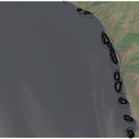
You can see, to some extent, folk circling the same areas, and their varying degrees of specificity. What does this result in if we want a heatmap of number of users selecting each pixel on which to do our analysis? Well, here you go!
Next time, a more quantitative look.
Variation in Kelp Selection is Beautiful
For the next post or three, I’m going to talk about what I see when I look at the data from one image. In the coming weeks, I hope to get at putting together bigger spatial or temporal results. But for the moment, I’m going to begin with what we see when we look at user classifications of one image. I’m going to begin with something beautiful – human variation.
This is the variability from person to person that we see in circling the same set of beds. I just find it striking and lovely.

Who’s Getting Kelpy at Floating Forests?
Well, we’ve finally hit a critical mass of classifications (well, blown past it) and other projects by science team members have boiled down (we’ll be posting about them – they’re kelpy!), so we’ve begun to dig into the data. For anyone who wants to follow along at him, all code that we talk about will be posted in this github repository.
I thought I’d begin by telling you all about how *you* have been interacting with Floating Forests. Namely, how much effort do the ~5,100 users of FF put into FF the project
Many Zooniverse projects do well from a lot of people doing just a few images each. We’re no different. We have a nice distribution of folk with many doing few images (~1,500 have done just one classification), but with a looong tail with many users in the 100 to 1000 range. See below, but note the log10 scale on the x-axis.
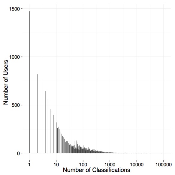
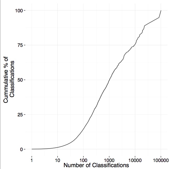
The average user, though, does ~125 classifications. If we put it together and look at the cumulative percentage of classifications done by users who classify different numbers of images, we see that ~25% is done by those users who classify less than ~250 images. So, our ‘super-users’ are incredibly important! Heck, we have one users who has contributed 5.15% of the classifications. The top 10 have contributed 18% of classifications.
It may still be difficult to see just how much those users are doing in comparison to users classifying only a few images. So, we’ve done what many other zooniverse projects have done, made a treemap!
It’s not only incredibly informative – with the size of each square being proportional to the contribution of an individual users – but, oh, pretty data! Enjoy!


Recent Comments