
Floating Forests Comes to the Classroom!
Hello everyone! It’s been a while since our last update but we want to share some exciting new developments.
One thing that we frequently get asked is how Floating Forests can be used as a classroom activity. In the past, we haven’t had a particularly structured response; most classroom integration of Floating Forests has been case by case and informal. While there is certainly great value in self-motivated exploration, tools like Floating Forests really shine when they are presented alongside the background and context that allows participants to more deeply connect with what they are seeing.
In order to close this gap and learn about how we can better incorporate citizen science into the classroom, Zooniverse has collaborated with project scientists to create structured lab activities that give students a chance to learn about projects on a higher level. We are very excited to announce that Floating Forests was one of those projects, and our activity has been released! Check it out here on the Zooniverse classrooms page! While you’re there, feel free to look around some of the other projects as well: here is a top-level link.
This activity was initially developed for undergraduates in general education science courses, but it is appropriate for any undergraduate environmental science (or similar) course, and should be easily adaptable for high school or middle school. If you are a K12 educator and you have any interest in such an adaptation, PLEASE REACH OUT via email at this link – we would love an opportunity to expand this content!
The activity itself can be found here, and is suitable for most course formats, including virtual or asynchronous learning. It has three sections: 1) climate change background, 2) an introduction to Floating Forests, and 3) several case studies that present data generated by citizen scientists on Floating Forests in the context of climate change.
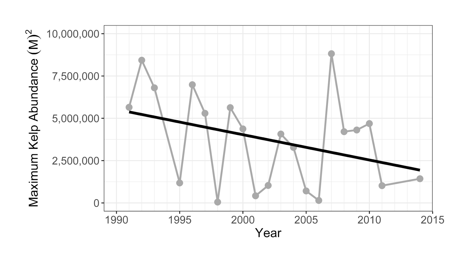
Example figure from our activity. This graph depicts kelp coverage in Tasmania, Australia as classified by Floating Forests participants. Students are also provided with additional data about kelp life history, as well as a temperature record of the local area and tasked with elucidating how kelp coverage and water temperature are related.
Although we hope folks pick up some concrete knowledge about climate change and kelp, the true goal of this activity is to foster scientific self-efficacy, data literacy, and self-confidence that will allow participants to be more self-sufficient with regard to scientific topics in our modern lives. We do this by presenting information in several ways including text, graphs, maps, and hypothetical debates. We also emphasize topics that are transferable out of environmental science, such as thinking at multiple scales and recognizing (and articulating) patterns in graphs.
This activity is free to use and has been pilot tested by over 1000 students at 6 universities: based on our evaluations, we are confident that it is a positive experience for our participants. We’ve received a lot of great feedback so far but that said, we are always happy to hear from anyone who gives it a try! Don’t hesitate to reach out with any questions, comments, suggestions, or concerns!
A Tale of Plankton and Sewage
Welcome back for another update! Our urban kelp survey is now 100% live. Thanks to you all we BLEW through our first round of images (seriously, over 8000 images in exactly one month!!!) , and we are now ready to start classifying kelp!
Today we’ll briefly talk about our choice for our California site, Los Angeles.

Image Source: Google Earth, accessed 6/12/2020
LA is currently the largest in our study, at least in terms of population/density. It saw its biggest population boom in the early to mid 1900s as both the entertainment and war industries grew. Unfortunately for us, we don’t have satellite data from this time. While we are missing the major population growth spike, Los Angeles continues to be a major metropolitan hub – it is the 2nd most populated city in the United States, and one of the largest worldwide!
The kelp forests in California have a patchy (ha ha…) history that is often closely linked to human activities – If you ask a phycologist about it, you’ll almost certainly hear about the Point Loma and Palos Verdes kelp forests. These two coastal kelp beds are located near San Diego and Los Angeles, respectively, and are infamous for sustaining massive kelp loss in the first half of the 1900s. This was due to a variety of factors, some natural and some human, but it seems that urban sewage discharge was the straw that broke the kelp forests back.
In the case of Point Loma, a broken sewage pipe discharged almost 200 million gallons of sewage into the kelp forest, leading to quick and major kelp loss. Luckily the area quickly recovered after the pipe was repaired – one advantage of kelp’s fast and furious life style is that it can quickly repopulate a large area if environmental conditions are restored! Palos Verdes has had a longer road to recovery, although recent restoration efforts have been successful in recovering many acres of kelp forest.
Discharge from sewer systems is bad for kelp in several ways. The discharge tends to be full of sediments (solid material suspended in the water). This can prevent growing kelp from getting sufficient light or can even completely bury small individuals. Another negative impact associated with these outfalls is nutrient pollution. In some cases, chemicals like ammonia can spike to toxic levels, causing immediate damage.
In other cases, elevated nutrient levels can simply “fertilize” the water. Your first reaction might be to think that this would be good for the kelp, and maybe in a vacuum it would be, but nature isn’t that simple. In this case, the complication comes from phytoplankton, which can compete with kelp for light by forming floating algal mats that block light and shade the seafloor.
Kelp grows quickly, but not as quickly as phytoplankton. When water nutrient levels are elevated (a condition called eutrophication), plankton growth can ramp up into what is called a plankton bloom. That’s a lot of words to say that these algal blooms can have major effects on the ecosystem. This picture might “clear” things up (ecological puns never get old…). These thick green algal blooms are more characteristic of fresh water, but I think this does a good job of illustrating how severe these can be.

Image source: Tim Otten, Oregon State University
The immediate, kelp-relevant effect is a reduction in light at the sea floor. The longer term effects can include reduced oxygen levels in the water, creating uninhabitable “dead zones. This low-oxygen condition is called hypoxia and is a result of rotting phytoplankton. The typical life cycle of a bloom goes something like this:
- Eutrophication event (discharge or runoff causes elevated nutrient levels in the water)
- Algal bloom (opportunistic plankton grow exponentially given high nutrient levels)
- Overgrowth (algal population exceeds available nutrients; growth eventually stops as nutrients are depleted) – Light levels beneath the water’s surface reduced
- Decomposition (algal bloom dies and decomposes. Bacteria associated with decomposition consume oxygen, creating a dead zone) – Hypoxic conditions form, many animals die or leave
Kelps are potentially affected by almost every step of this process. They are shaded out by the initial bloom and then potentially buried in detritus as the plankton decomposes. Many of the animals found in kelp forests are vulnerable to the dead zones caused by algal blooms. Loss of these kelp forest residents can further destabilize the ecosystem.
While the stories of Point Loma and Palos Verdes unfortunately played out mostly outside of Floating Forest’s time window, they serve as clear reminders that human activities can seriously affect kelp forests. Things like sewage discharge and eutrophication are global issues; California may be a high profile example, but is far from the only one. As we continue to explore the effects of urbanization, we will be sure to include as many local factors (such as sewage treatment outfall points) as possible to best understand each of our sites.
Kelp and the Big City
If you’ve read through our “about section” or seen our blog in the past, you’ll know that kelp is threatened by climate change. This is perhaps the main reason why we are so interested in kelp in the first place, and so far Floating Forests has allowed us to build some of the most complete kelp forest datasets around. Soon we will be adding a new set of images to the project, this time examining a few key, high-risk locations with a fine-toothed comb. We’re interested in how coastal construction or development might impact kelp forests – it’s time to take our kelp research to the city! We will be taking a close look at kelp forests in California, Chile, Argentina, Australia, and New Zealand.
While global climate change is extremely important, there is great value in examining smaller scales as well. In fact, studies such as this one have shown that kelp forests are strongly affected by local conditions! As you might expect, changes to these local environmental conditions can have significant effects on the local wildlife.
We call changes that affect the environment “drivers”. For example, a construction project could “drive” environmental change by releasing sand and dirt (which are collectively referred to as “sediments”) into the water. When two different drivers interact and affect each other, we refer to them as “synergistic”. Occasionally they can create especially favorable conditions, but often one exacerbates the negative effects of the other, so we call these “synergistic stressors”.
One way to think about this is to say that one driver can amplify the effects of another. For example: a marine ecosystem might be able to handle a 2° Celsius increase in average temperature without collapsing. Separately, it also might be able to handle the effects of a large construction project. However, the effects of both at the same time could prove catastrophic: organisms already stressed by warming might not be able to cope with disturbances caused by the construction, and most importantly, things might get bad much more quickly than we might expect.
Because an emoji is worth a thousand words:

This example is one of the many that play out across an ever-developing world. One consistent trend over the last several decades has been a large increase in coastal population. To say this more plainly – more people than ever before live near the coast. As coastal cities grow, constant expansion is needed in order to keep up with the population. This conversion of land from natural to urban terrain is known as “urbanization” and brings with it a host of environmental impacts – some of which are potentially harmful for kelp forests.
By digging into the satellite record, we can get an idea of how kelp forests in urban areas have changed over the last few decades in response to this trend of development. What’s really exciting about this opportunity is that with the power of citizen science we can cover a lot of ground: we want to compare cities across the globe in order to build a better understanding of how kelp in different places is affected by human activities. We expect there to be many interesting differences between these locations – it would probably be more surprising to learn that kelp in Australia was acting exactly like kelp in Chile!
Stay tuned as we prep for the launch of this exciting phase of Floating Forests – details about our study sites and more about the connections between urbanization and kelp coming soon!
Kelp On The Edge!
With the Falklands classifications wrapping up, it’s time to move on to our next phase of global kelp mapping – kelp on the edge! Giant kelp is a cold water species – warm nutrient poor water is a definite no. Their range extends towards the equator wherever they are found until they hit a wall of warm water. There they shall stop, and no further.
But what about when that wall – that range edge – starts heating up? That’s when you’ve got…

We’ve witnessed a variety of other kelps die back when things got to hot, and our own Jorge Assis has shown some projected major range shifts of kelps in the future.
With the data from Floating Forests, one question we want to ask is, how have kelps on the edge been faring? Over the past 35 years, have we seen kelps on warm water range edges dwindling? Have any of those populations blinked out? Have the ranges of giant kelp actually been on the move?
The great thing about this project is the simplicity of the question. Rather than circling kelp beds (although we’ll get there), we want to begin just by looking at range edges of giant kelp around the planet and the area up to 500km away and ask you just to note, do you see any kelp? Yes or no? That’s it!
We’re also putting kelp on the edge into the Zooniverse app where you can swipe right for kelp! click here for the iPhone app or here for android!
The first set of images is up – from Baja California using Landsat 7 and 8. L4 and L5 imagery will come in the next few days, and more of Baja and then New Zealand next week.
So what are you waiting for! Pull out your phones and get swiping! (or click here.
Also… the music we can’t get out of our heads
There’s somethin’ wrong with the kelp today
I don’t know what it is
Something’s you’ll see with our eyes
We’re classifyin’ things in a different way
With swipe fast left or right
The data will surprise
Kelp’s livin’ on the edge!
Floating Forests and Google Maps
Often when citizen scientists view an image, they want context. Where is this? Am I really seeing kelp, or is this sand or mudflats? Fortunately, we have you covered. In the video below, I show you how you can view the metadata about each individual image, including how to view the area pictures in Google Maps. Now, the map on Google Maps isn’t going to be from the same time as the Landsat image, so, there may or may not be kelp in the same places. But you can at least get a better high resolution view of the area to make decisions about your classifications if you want it.
Does Citizen Science Consensus Alter Time Series?
One question that has come up a few times with our consensus classifications is, does the level really matter when it comes to looking at change in kelp forests over the long-term?
While our data isn’t quite up to looking at large-scale timeseries yet (we’re still digging through a few thorny methodological issues), I grabbed the complete dataset we have for the Landsat scene around Los Angeles from work Isaac is doing and decided to take a look. Note, this is totally raw and I haven’t done any quality control checking on it, but the lessons are so clear I wanted to share them with you, our citizen scientists.
After aggregating to quarterly data and then selecting the scene that had the highest kelp abundance for that quarter (i.e., probably the fewest clouds obscuring the view), we can see a few things. First, yeah, 1 classifier along is never good.

Note, I haven’t transformed the data to area covered, instead we’re just going with number of pixels (1 pixel = 30 x 30m). But, wow, we need consensus!
But what if we impose a more conservative filter? Say, a 4-10 user agreement threshold? What does that show us?

What I find remarkable about this image is that while we see the effect of decreases in detection when more and more citizen scientists have to agree on a pixel, the trends remain the same. This means that while we will try to chose the best threshold that will give us the closest true estimate of kelp area, that there will be multiple intermediate thresholds that give us the same qualitative results to any future attempts at asking questions of this data set.
This is a huge relief. It means that, as long as we stay within a window where we are comfortable with consensus values, this data set is going to be able to tell us a lot about kelp around the world. It means that citizen science with consensus classifications is robust to even some of the choices we’re going to have to make as we move forward with this data.
It means you all have done some amazing work here! And we can be incredibly confident in how it will help us learn more about the future of our world’s Floating Forests!
Lining Up Consensus
In working on a recent submission for a renewal grant to the NASA Citizen Science program, I whipped up a quick script that takes the data posted and overlays it with the actual image. I really like the results, so here’s one. Feel free to grab the script, data, and play along at home!

Data from Floating Forests for YOU!
The day has come – we’re finalizing our data pipeline to return data to you, our citizen scientists! It’s been a twisty road, and we’re still tweaking, but we’ve begun to build some usable products for your delecation and exploration!
We want to know more from **you** about what you want and what is interesting for you to explore, so, today, I’m going to post some demo data for you to look at and give us feedback and comments on. This is a data file from our California project that consists of polygons for each kelp forest at different levels of user agreement on whether pixels are kelp or not. So, first, here’s the file in three formats (depending on what you want) (we can also add more if asked for)
SQLite Lat/Long Projection
RDS (native R format) Lat/Long Projection
RDS (native R format) UTM Projection (Zone 10)
You can do a lot with these in whatever GIS software is your preference, and if anyone has examples, we’d love to post them! For now, here’s a quick and dirty visualization of the whole shebang at the 6 users agreeing on a pixel per threshold (source.

Neat, huh? You can even see where something in one image was confusing (no kelp on land!) which now I’m *very* curious about.
So, what’s in this dataset? There’s a lot, but here are things most relevant to you
threshold – the number of users who agree on the pixels in a given polygon are kelp
zooniverse_id – the subject (i.e., tile) id of a given image, if you want to just look at a single image, subset to that id
scene – Individual Landsat “images” are called scenes. So, every subject that we served to users was carved out of a scene. You can look at a whole scene by subsetting on this column. For more about what a scene name means, see here
classification_count – number of users who looked at a given subject
image_url – to pull up the subject as seen on Floating Forests
scene_timestamp – when was an image taken by the satellite?
activated_at – when did we post this to Floating Forests?
There’s a lot of other info regarding subject corner geospatial locations. We might or might not trim this out in future versions, although for now it helps us locate missing data and see what has actually been sampled.
So, take a gander, enjoy, and if you have any comments, fire them off to us! This is just a sample, and there’s more to come!
Kelp Forest Heatmap: Nightvision Edition
It’s been a bit since I promised calibration info, but we’ve hit a minor (almost solved) projection issue in comparing our data to some gold-standard data we have. So, to stave off boredom while the real geographers on our team do the heavy lifting, I’ve been futzing about with making the generation of overall indices easier. I arrived at a neat solution using Spatial Grids in R that was much faster than switching back and forth between rasters. The biggest bonus is that the default plotting of results with color as number of people selecting an area is *purty!*
Or at least, I think so.
How does this kelp forest look to you?

2 Million Kelp Classifications at Floating Forests!
Well, I woke up this morning, fired up Floating Forests, as is my wont, and saw this! I thought it would be a few more days, and was even going to post some exhortation, but you guys have been too awesome and brought us to 2 million classifications yourself!
DAMN!
Nice work, all! And now it looks like we’re going to need to throw some new regions your way soon!

Recent Comments