
Kelp On The Edge!
With the Falklands classifications wrapping up, it’s time to move on to our next phase of global kelp mapping – kelp on the edge! Giant kelp is a cold water species – warm nutrient poor water is a definite no. Their range extends towards the equator wherever they are found until they hit a wall of warm water. There they shall stop, and no further.
But what about when that wall – that range edge – starts heating up? That’s when you’ve got…
We’ve witnessed a variety of other kelps die back when things got to hot, and our own Jorge Assis has shown some projected major range shifts of kelps in the future.
With the data from Floating Forests, one question we want to ask is, how have kelps on the edge been faring? Over the past 35 years, have we seen kelps on warm water range edges dwindling? Have any of those populations blinked out? Have the ranges of giant kelp actually been on the move?
The great thing about this project is the simplicity of the question. Rather than circling kelp beds (although we’ll get there), we want to begin just by looking at range edges of giant kelp around the planet and the area up to 500km away and ask you just to note, do you see any kelp? Yes or no? That’s it!
We’re also putting kelp on the edge into the Zooniverse app where you can swipe right for kelp! click here for the iPhone app or here for android!
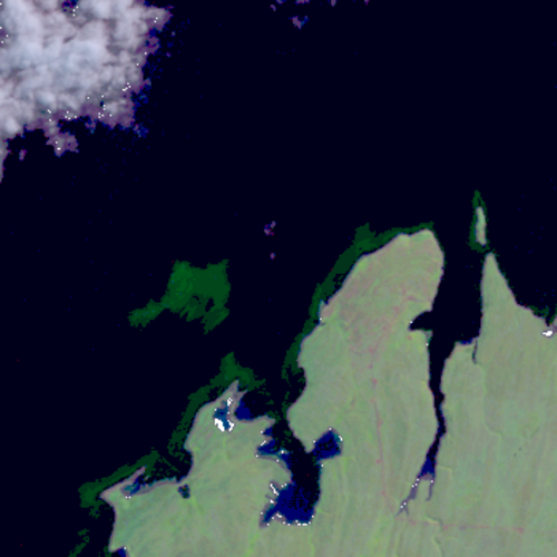
The first set of images is up – from Baja California using Landsat 7 and 8. L4 and L5 imagery will come in the next few days, and more of Baja and then New Zealand next week.
So what are you waiting for! Pull out your phones and get swiping! (or click here.
Also… the music we can’t get out of our heads
There’s somethin’ wrong with the kelp today
I don’t know what it is
Something’s you’ll see with our eyes
We’re classifyin’ things in a different way
With swipe fast left or right
The data will surprise
Kelp’s livin’ on the edge!
Zoom is coming!

Hey, all! You have asked us multiple times for a zoom interface. We have some reasons not to use a zoom tool – tradeoffs with speed, variability in accuracy between classifiers, etc. – but are intrigued and want to put our intuition to the test. If it’s better, we’ll switch to it full time, most likely! If the tradeoff isn’t worth it, we’ll know, and we’ll probably have an interesting paper come out of it.
But – we want to hear from you! In addition to the zoom interface itself (basically, the classify interface + a pan and zoom tool), are there questions you think we should be asking you after you complete a zoom classification that could yield new and interesting insights? Let us know over here!
Floating Forests and Google Maps
Often when citizen scientists view an image, they want context. Where is this? Am I really seeing kelp, or is this sand or mudflats? Fortunately, we have you covered. In the video below, I show you how you can view the metadata about each individual image, including how to view the area pictures in Google Maps. Now, the map on Google Maps isn’t going to be from the same time as the Landsat image, so, there may or may not be kelp in the same places. But you can at least get a better high resolution view of the area to make decisions about your classifications if you want it.
Does Citizen Science Consensus Alter Time Series?
One question that has come up a few times with our consensus classifications is, does the level really matter when it comes to looking at change in kelp forests over the long-term?
While our data isn’t quite up to looking at large-scale timeseries yet (we’re still digging through a few thorny methodological issues), I grabbed the complete dataset we have for the Landsat scene around Los Angeles from work Isaac is doing and decided to take a look. Note, this is totally raw and I haven’t done any quality control checking on it, but the lessons are so clear I wanted to share them with you, our citizen scientists.
After aggregating to quarterly data and then selecting the scene that had the highest kelp abundance for that quarter (i.e., probably the fewest clouds obscuring the view), we can see a few things. First, yeah, 1 classifier along is never good.
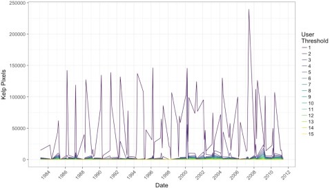
Note, I haven’t transformed the data to area covered, instead we’re just going with number of pixels (1 pixel = 30 x 30m). But, wow, we need consensus!
But what if we impose a more conservative filter? Say, a 4-10 user agreement threshold? What does that show us?
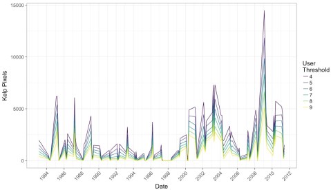
What I find remarkable about this image is that while we see the effect of decreases in detection when more and more citizen scientists have to agree on a pixel, the trends remain the same. This means that while we will try to chose the best threshold that will give us the closest true estimate of kelp area, that there will be multiple intermediate thresholds that give us the same qualitative results to any future attempts at asking questions of this data set.
This is a huge relief. It means that, as long as we stay within a window where we are comfortable with consensus values, this data set is going to be able to tell us a lot about kelp around the world. It means that citizen science with consensus classifications is robust to even some of the choices we’re going to have to make as we move forward with this data.
It means you all have done some amazing work here! And we can be incredibly confident in how it will help us learn more about the future of our world’s Floating Forests!
Lining Up Consensus
In working on a recent submission for a renewal grant to the NASA Citizen Science program, I whipped up a quick script that takes the data posted and overlays it with the actual image. I really like the results, so here’s one. Feel free to grab the script, data, and play along at home!
Coastlines of Floating Forests
Some of you have noted in earlier posts of this preliminary dataset that some classifications show up on land – particularly at low thresholds. This is likely due to some images being served up that, shouldn’t have been (we’ve fixed this in the new pipeline), and the zeal of some classifiers. Regardless, we can crop out those areas, as we know that there’s no real kelp there. But do to it, we need some very very good maps of the coastline. Fortunately, there’s a solution!
The Global Self-consistent, Hierarchical, High-resolution Geography Database is an incredible resource, with some coastline data files that are remarkable in their detail. The data is also, of course, huge. So, for anyone playing along at home, we’ve subsetting it down to a few files for you delectation. These are all in the common ESRI Shapefile format, but if folks want them otherwise, we’re happy to provide. Here’s what we’ve created for you. Click on the names of the areas below to download the zip files.
First, California
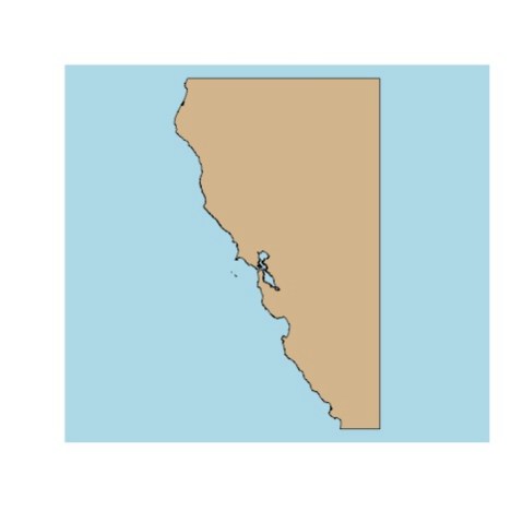
Then, Tasmania
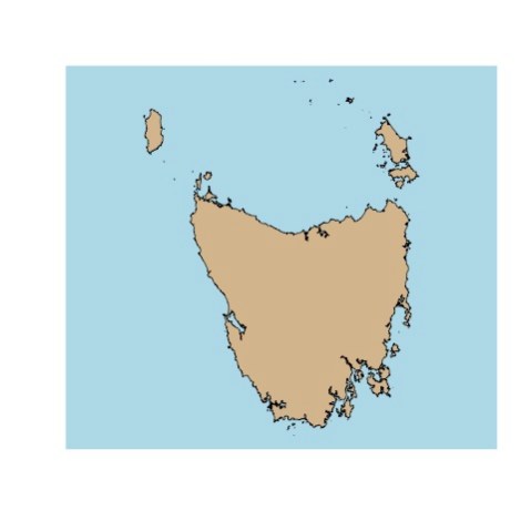
And last, the absolutely stunning Falkland Islands

When we used them for coastal cropping, they worked great – we’ll show some timeseries with cropped data next week!

Red areas are in the ocean, blue is on land.
Kelpy Consensus
At Floating Forests, we get confronted with two issues a lot. First, how good is the data? A lot of scientists are still skeptical of citizen science (wrongly!) Second, many citizen scientists worry that they need to achieve a level of accuracy that would require near-pixel levels of zooming. We approach both of these issues with consensus classification – namely, that every image is seen by 15 people as soon as it’s noted that it has kelp in it. We can then build up a picture of kelp forests where, for each pixel, we note how many users select it as, indeed having kelp. You can read an initial entry about this here.
So, how does this pan out in the data I posted a few days back? Let’s explore, and I’ll link to code in our github repo for any who want to play along at home if you’re using R – I’d love to see things generated in other platforms!
The data is a series of spatial polygons, each one representing one level of consensus. After loading the data we can look at a single subject to see what consensus does.

I love this, as you can see both at the 1 threshold at least one person was super generous in selecting kelp. However, at the 10 threshold (unclear why we’re maxing at 10 here – likely nothing was higher!) super picky classifiers end up conflicting with each other so it looks like there’s no kelp here.
How does this play out over the entire coast? Let’s take a look with some animations. First, the big kahuna – the whole coast! Here are all of the classifications from 2008-2012 overlapping (I’ll cover timeseries another time).
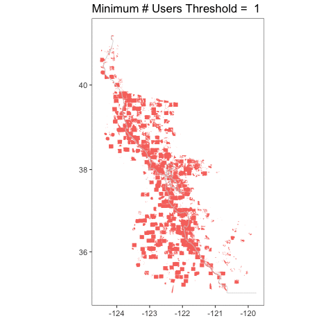
I love this, because you can really see how crazy things are at a single user, but then they tamp down very fast. You can also see, given that we have the whole coastline, how, well, coastal kelp is! Relative to the entire state, the polygons are not very large. It’s a bit hard to see.
Let’s look at the coastline north of San Francisco Bay, from Tomales to roughly Point Arena.
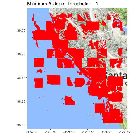
Definitely clearer. You can also see we accidentally served up some lake photos, and folk probably circled plankton blooms. Oops! Now the question becomes, what is the right upper threshold? Time (and some ongoing analysis which is suggesting somewhere between 6-8) will tell!
If you have ideas for other visualizations you want to see, queries for the data that you want us to make, or more, let us know in the comments! If you want to see some other visualizations we’ve been whipping up, see here!
Data from Floating Forests for YOU!
The day has come – we’re finalizing our data pipeline to return data to you, our citizen scientists! It’s been a twisty road, and we’re still tweaking, but we’ve begun to build some usable products for your delecation and exploration!
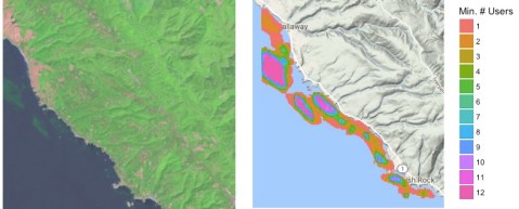
We want to know more from **you** about what you want and what is interesting for you to explore, so, today, I’m going to post some demo data for you to look at and give us feedback and comments on. This is a data file from our California project that consists of polygons for each kelp forest at different levels of user agreement on whether pixels are kelp or not. So, first, here’s the file in three formats (depending on what you want) (we can also add more if asked for)
SQLite Lat/Long Projection
RDS (native R format) Lat/Long Projection
RDS (native R format) UTM Projection (Zone 10)
You can do a lot with these in whatever GIS software is your preference, and if anyone has examples, we’d love to post them! For now, here’s a quick and dirty visualization of the whole shebang at the 6 users agreeing on a pixel per threshold (source.

Neat, huh? You can even see where something in one image was confusing (no kelp on land!) which now I’m *very* curious about.
So, what’s in this dataset? There’s a lot, but here are things most relevant to you
threshold – the number of users who agree on the pixels in a given polygon are kelp
zooniverse_id – the subject (i.e., tile) id of a given image, if you want to just look at a single image, subset to that id
scene – Individual Landsat “images” are called scenes. So, every subject that we served to users was carved out of a scene. You can look at a whole scene by subsetting on this column. For more about what a scene name means, see here
classification_count – number of users who looked at a given subject
image_url – to pull up the subject as seen on Floating Forests
scene_timestamp – when was an image taken by the satellite?
activated_at – when did we post this to Floating Forests?
There’s a lot of other info regarding subject corner geospatial locations. We might or might not trim this out in future versions, although for now it helps us locate missing data and see what has actually been sampled.
So, take a gander, enjoy, and if you have any comments, fire them off to us! This is just a sample, and there’s more to come!
Have a Very Kelpy Holiday!
Thanks to all of our great citizen scientists! I loved this Tweet from Trine Bekkby and the Norwegian Blue Forests Network so much that I thought I’d post it. Look at that Laminara hyperborea! SO GORGEOUS!
From our kelp to your kelp, happy holidays!
Seasonality in the Falklands
As I’ve been browsing through these beautiful images of classifications in the Falklands, I realized something. One of the reasons to explore the Falklands is that there aren’t too many studies looking at more long-term kelp dynamics there. Now, I’m a Northern Hemisphere kelp forest ecologist. We know that typically many types of kelp forests start to boom in the spring, get to peak biomass in the late summer/early fall, and then get whacked back by fall/winter storms before booming again in the spring.
A #sokelpy image in #march
One of the first questions I have as a scientist, then, is do we see the same seasonal trends in the Falklands? I’m very curious what y’all are seeing, so, I started a thread on talk asking y’all to note any observations. Please also tag very kelpy images with the month they were taken (click the (i) for information) as well as the #sokelpy hashtag, so I can do a quick search by hashtag to see frequency of when #sokelpy occured. I’ll post the resulting data after we get a decent set of tagged images.
And talk about what you’re seeing – month by month, or if you’re noticing certain years have more or less kelp over in the thread!
(And, heck, we haven’t even talked about north v. south side of the islands – but that’s for another time!)

Recent Comments