
Floating Forests and Google Maps
Often when citizen scientists view an image, they want context. Where is this? Am I really seeing kelp, or is this sand or mudflats? Fortunately, we have you covered. In the video below, I show you how you can view the metadata about each individual image, including how to view the area pictures in Google Maps. Now, the map on Google Maps isn’t going to be from the same time as the Landsat image, so, there may or may not be kelp in the same places. But you can at least get a better high resolution view of the area to make decisions about your classifications if you want it.
Does Citizen Science Consensus Alter Time Series?
One question that has come up a few times with our consensus classifications is, does the level really matter when it comes to looking at change in kelp forests over the long-term?
While our data isn’t quite up to looking at large-scale timeseries yet (we’re still digging through a few thorny methodological issues), I grabbed the complete dataset we have for the Landsat scene around Los Angeles from work Isaac is doing and decided to take a look. Note, this is totally raw and I haven’t done any quality control checking on it, but the lessons are so clear I wanted to share them with you, our citizen scientists.
After aggregating to quarterly data and then selecting the scene that had the highest kelp abundance for that quarter (i.e., probably the fewest clouds obscuring the view), we can see a few things. First, yeah, 1 classifier along is never good.
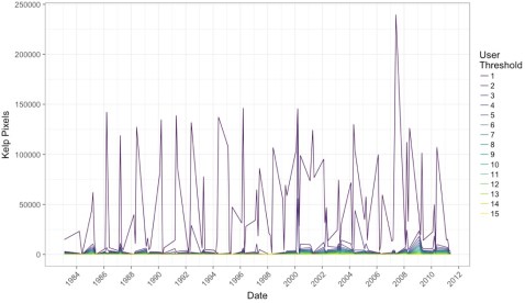
Note, I haven’t transformed the data to area covered, instead we’re just going with number of pixels (1 pixel = 30 x 30m). But, wow, we need consensus!
But what if we impose a more conservative filter? Say, a 4-10 user agreement threshold? What does that show us?
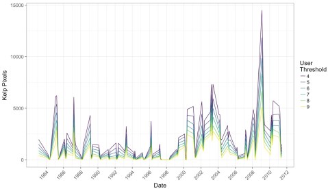
What I find remarkable about this image is that while we see the effect of decreases in detection when more and more citizen scientists have to agree on a pixel, the trends remain the same. This means that while we will try to chose the best threshold that will give us the closest true estimate of kelp area, that there will be multiple intermediate thresholds that give us the same qualitative results to any future attempts at asking questions of this data set.
This is a huge relief. It means that, as long as we stay within a window where we are comfortable with consensus values, this data set is going to be able to tell us a lot about kelp around the world. It means that citizen science with consensus classifications is robust to even some of the choices we’re going to have to make as we move forward with this data.
It means you all have done some amazing work here! And we can be incredibly confident in how it will help us learn more about the future of our world’s Floating Forests!
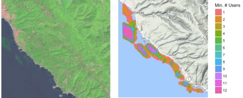
Lining Up Consensus
In working on a recent submission for a renewal grant to the NASA Citizen Science program, I whipped up a quick script that takes the data posted and overlays it with the actual image. I really like the results, so here’s one. Feel free to grab the script, data, and play along at home!

Recent Comments