
2 Million Kelp Classifications at Floating Forests!
Well, I woke up this morning, fired up Floating Forests, as is my wont, and saw this! I thought it would be a few more days, and was even going to post some exhortation, but you guys have been too awesome and brought us to 2 million classifications yourself!
DAMN!
Nice work, all! And now it looks like we’re going to need to throw some new regions your way soon!
Heatmap of Kelp Selection Overlap
A lot of what we’ll be working on to determine area of beds are heatmaps of users selecting a pixel as kelp. This sounds somewhat abstract, so I wanted to operationalize it for you with some images. Let’s start with a single image from Floating Forests chosen because it has been flagged as having kelp. It has 13 classifications, so, one more and it is ‘complete’ – unless we decide to lower the classification threshold. The image is
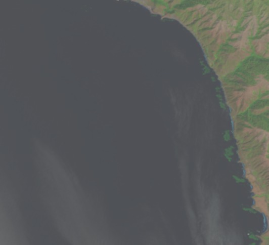
So, what would it look like if we overlaid all of the outlines of users outlining kelp from the other day on the image?
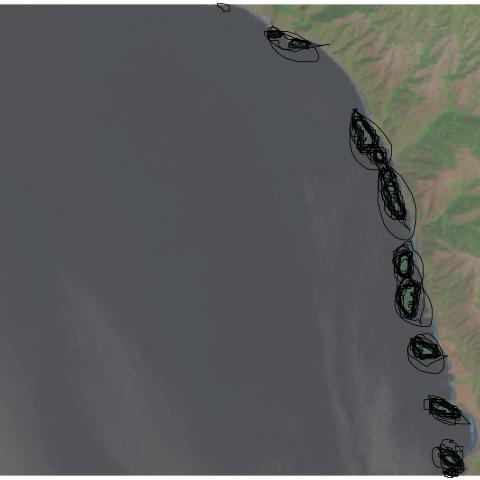
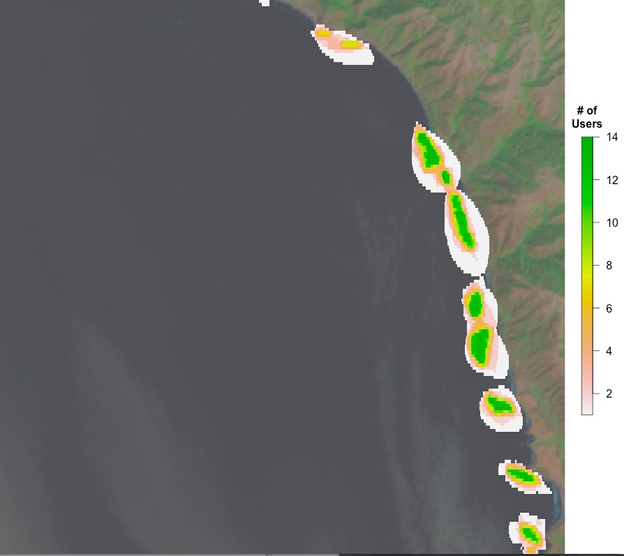
You can see, to some extent, folk circling the same areas, and their varying degrees of specificity. What does this result in if we want a heatmap of number of users selecting each pixel on which to do our analysis? Well, here you go!
Next time, a more quantitative look.
Variation in Kelp Selection is Beautiful
For the next post or three, I’m going to talk about what I see when I look at the data from one image. In the coming weeks, I hope to get at putting together bigger spatial or temporal results. But for the moment, I’m going to begin with what we see when we look at user classifications of one image. I’m going to begin with something beautiful – human variation.
This is the variability from person to person that we see in circling the same set of beds. I just find it striking and lovely.

Who’s Getting Kelpy at Floating Forests?
Well, we’ve finally hit a critical mass of classifications (well, blown past it) and other projects by science team members have boiled down (we’ll be posting about them – they’re kelpy!), so we’ve begun to dig into the data. For anyone who wants to follow along at him, all code that we talk about will be posted in this github repository.
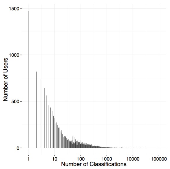
I thought I’d begin by telling you all about how *you* have been interacting with Floating Forests. Namely, how much effort do the ~5,100 users of FF put into FF the project
Many Zooniverse projects do well from a lot of people doing just a few images each. We’re no different. We have a nice distribution of folk with many doing few images (~1,500 have done just one classification), but with a looong tail with many users in the 100 to 1000 range. See below, but note the log10 scale on the x-axis.
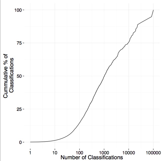
The average user, though, does ~125 classifications. If we put it together and look at the cumulative percentage of classifications done by users who classify different numbers of images, we see that ~25% is done by those users who classify less than ~250 images. So, our ‘super-users’ are incredibly important! Heck, we have one users who has contributed 5.15% of the classifications. The top 10 have contributed 18% of classifications.
It may still be difficult to see just how much those users are doing in comparison to users classifying only a few images. So, we’ve done what many other zooniverse projects have done, made a treemap!
It’s not only incredibly informative – with the size of each square being proportional to the contribution of an individual users – but, oh, pretty data! Enjoy!

Let There Be Coast!
Note: This post is from Briana Harder, our newest Science Team member! We encountered Briana in Talk where she not only noted some issues, but then wrote code to reprocess images to fix them! Needless to say, we were impressed. What emerged was a wonderful dialogue between Briana, members of the science team, and the folk at Zooniverse. She’s made some large changes to our image processing pipeline and helped us all learn a lot about how to use Landsat for kelp in places *other* than California. As such, we asked Briana if she wanted to take her involvement to the next level, and join the Science Team. And we were delighted when she accepted! So, here are her comments on the awesome work she did and how our image processing has changed.
The first thing to do upon finding an interesting problem is to find out if anyone else has solved it already. So I searched for research in the areas of image analysis and coastlines and satellite imagery. The majority of the papers were far too detail oriented to be very helpful, the problems in tracking the month to month changes of the coastline of a small island are wildly different from sorting coast from non-coast for FF! But I did find a fascinating paper on using Landsat data to build a highly accurate waterline database for all of Europe. They clearly solved the problem of finding ocean coastline, and then went a lot further!
The technique they used was to take a cloudless mosaic of the region–lots of preprocessing there!– and separate the image into three regions, water and land, selected with simple pixel value thresholds, and unassigned pixels. They then ran a region growing algorithm to add the unassigned pixels to either area.
This was good find for me, because they’re solving a very similar problem, and I know how to implement both those things! Unfortunately region growing is relatively slow and expensive, and it probably wouldn’t play nice with cloudy images. I did more digging over the next week, without finding anything else that was more promising. So I sat down, and wrote a little program.
Simplicity is important when you’re working with a lot of data; if the running time of the algorithm is longer than a person would take to do the same task, something has gone horribly wrong! I went through a couple iterations on how to find water, but in the end, this is what I ended up with.
Water is any pixel where the red value is between 1 and 25. Water’s very dark in all the bands, but it’s darkest in red, so that’s the best way to find it. If we’re clever about it, we only need to read the pixel values once, and perform some simple math operations, which means it should hardly take longer than opening up the image to view it.
– Count all the pixels that are water.
– Count all the pixels that are black, value 0. This ensures it’s not biased to throw out images that are on the edges of the Landsat scene.
– Calculate the percentage of non-black pixels that are water.
– If that percentage is above a certain threshold, we’re good to go, keep this image. I picked 5% as the threshold, based on a little trial and error.
And that’s it! It by no means gets rid of ALL the non-coast images, for example this does absolutely nothing for the abundance partially cloudy ocean images. It also gets tripped up by dark shadows on land, either from clouds or mountains, as shadows are just dark enough to fall within that threshold. Lakes are also selected, if they’re big enough.
The more complicated part comes after algorithms are made and tested: building them into the existing image processing pipeline. I wrote my algorithm in Python, making use of a few key libraries to do all the image processing; the pipeline is in Ruby, and uses a tool call ImageMagick for its image processing. I’m good at programming Python, I’d never touched Ruby until working on this project! And ImageMagick does seem quite ‘magical’ to someone who hasn’t used it before.
After reducing the problem of non-coast images, there’s the problem of the dark and red images that are especially common in the Tasmania dataset. The red part has been solved, but the darkness is still there for a lot of images. I have more work to do! But for now, we can say goodbye to a big chunk of the non-coast images in the next data set. No more bright blue snow-capped mountains, or solid fluffy cloud tops, or endless squares of farmland.
I’ll see you on Talk!
Tasmania Images Back!
You may have noticed that for the past few months Floating Forests has only been serving up California images. The Tasmania images that we were analyzing last year have been offline due to some image quality issues. However, thanks to a lot of hard work by the Zooniverse team and power user/image processing magician Briana Harder we are happy to announce that the Tasmania images are back! Not only are the image quality issues fixed, Briana has helped us implement an algorithm to filter out cloudy images and images that don’t contain any coastline (see upcoming post for more details). As a result, hopefully you will be spending less time skipping bad images and more time outlining those beautiful kelp forests!
Less of this…
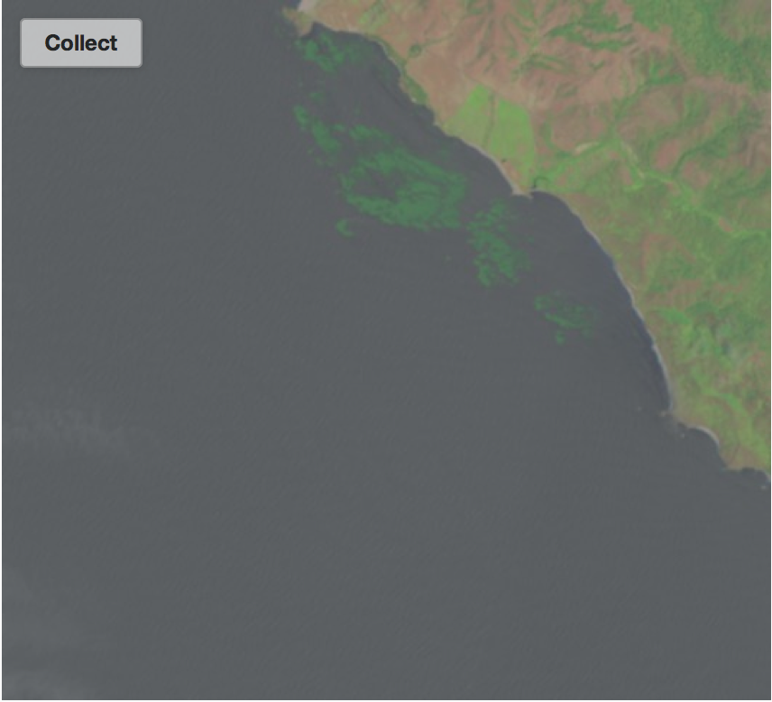
and more of this!
We have also improved the way in which we obtain images from USGS/NASA. This will make it easier for us to introduce data from other regions, so expect to see some images from Baja California, Chile, South Africa, and other temperate coastlines soon.
In the meantime, have fun with these Tasmania images. We’ve already started to document some major declines in kelp abundance in Tasmania over the past few decades thanks to your classifications. We are eager to obtain a better picture of these changes, but we need your help!
Mrs. Wilson’s 2nd Graders Talk Kelp – Floating Forests in the Classroom!
One of the things we love about Floating Forests is how simple it is, making it a great tool for classrooms. Just circle some kelp! And after only a few images, one begins to get a sense of some basic kelp biology – it’s close to the coast in shallow waters, we see less of it in the middle of winter, in some places we see less of it in later years than earlier.
This simplicity beguiles a wealth of concepts both simple and complex. One can use Floating Forests as a tool to teach basic environmental biology, population dynamics, or the ecology of climate change. Or one can use Floating Forests as a jumping off point for a classroom of kids interested in the ocean.
We’ve been lucky enough to start to interact with some great educators. We’re hoping to begin posting lesson plans for levels from elementary schools to college over at Zooteach. Here’s one of the first pieces to emerge from Fran Wilson’s wonderful 2nd grade class!
Kelp Forest on Artificial Reef
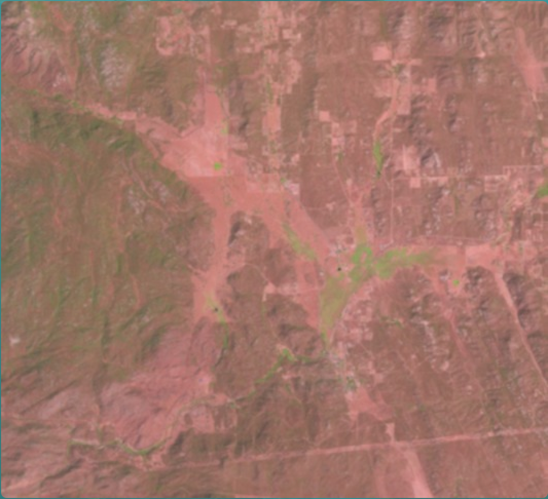
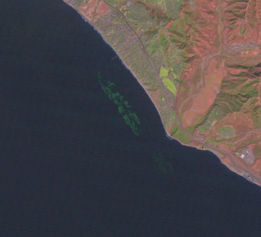
If you have been classifying images in California over the past few months, you may have come across an array of square kelp forests and wondered, “How did those get there?!” The story behind this amazing man-made kelp forest involves a nuclear power plant, a state agency, and some remarkable researchers.
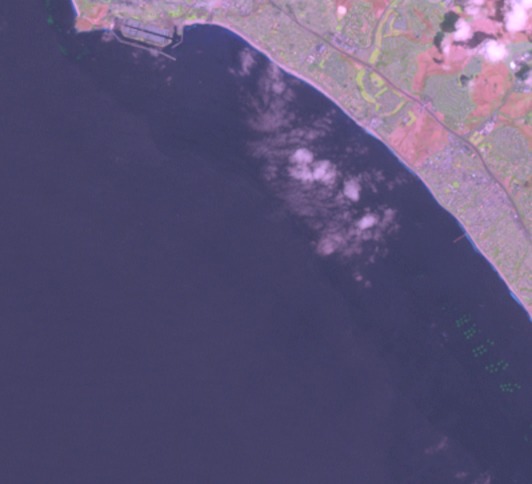
Artificial reef modules in the lower right corner!
In the early 1970’s the San Onofre Nuclear Generating Station (SONGS) proposed adding two additional reactor units to increase its power generation capacity. The California Coastal Commission (CCC) granted the permit in 1974, but as a condition of the expansion a Marine Review Committee was established to direct impact assessment studies on nearby coastal ecosystems that could be negatively affected by the additional reactor units. As a result of these studies, the CCC added new conditions for the mitigation of identified impacts, one of the conditions was the construction of an artificial reef to replace kelp bed resources lost as a result of SONGS’ cooling water discharge.
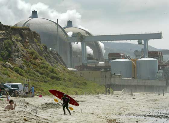
SONGS
The additional reactors are cooled by a single pass seawater system. As the warm water is discharged back to the environment it is cooled with additional seawater using diffusers. This process draws in ambient seawater at rate about 10x the discharge flow and is swept up along with sediments, which are transported offshore. This warm, sediment-laden plume led to substantial reductions in the abundance and density of kelp plants within the San Onofre kelp bed, as well as reductions in many kelp bed fish and invertebrate species.
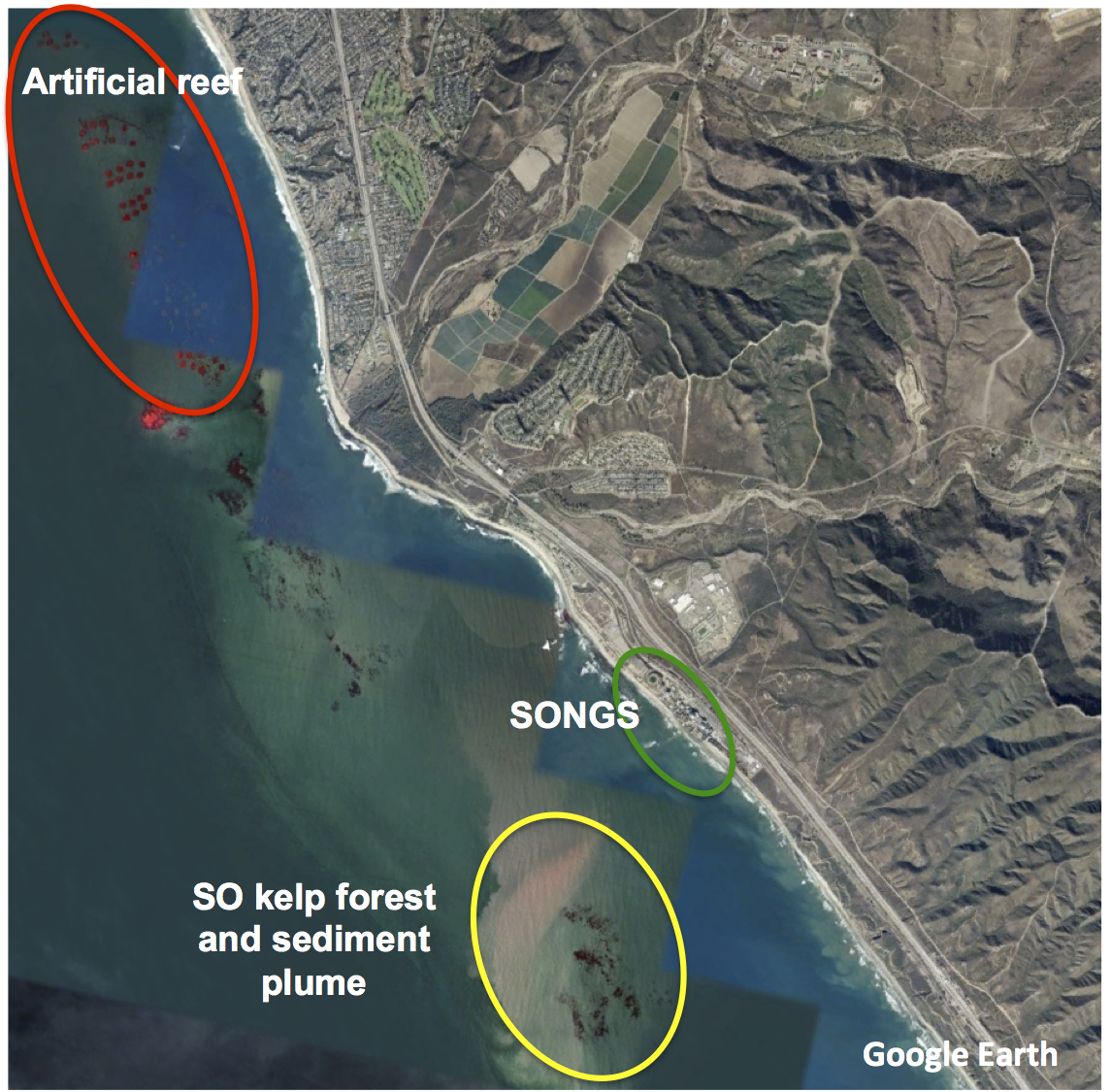
Locations of artificial reef modules, SONGS, and San Onofre kelp forest including sediment plume.
The mandated artificial reef had to be large enough to sustain 150 acres of kelp forest as compensation for the loss of 179 acres within the San Onofre kelp bed. This process began with a 5-year experimental phase that entailed building a smaller 22.4 acre reef to determine the substrate types and configurations that would support a giant kelp forest and associated biota during the later mitigation phase. The plan involved testing eight different reef designs that varied in substrate composition, substrate coverage, and the presence of transplanted kelp. Reef designs were implemented as 56 (40 m x 40 m) modules (7 replicates of the 8 designs), with construction completed in 1999. These are the squares seen on your images! Results obtained from monitoring the 5-year experiment showed a near-equally high tendency of all reef designs to meet the performance standards established for the mitigation phase, and the final recommendation was to build out the reef using low relief quarry rock or concrete rubble that covered between 42-86% of the bottom.
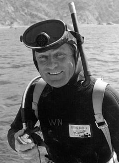
Dr. Wheeler North
Construction of the full artificial reef was completed in 2008 with the use of approximately 126,000 tons of boulder-sized quarry rocks, deposited into 18 polygons. When combined with the experimental reef, these areas provide 174.4 acres of hard substrate for the growth of giant kelp and associated species. The reef was named after the late Dr. Wheeler North, a pioneer in the understanding of kelp forest ecology. The coastal development permit to operate SONGS requires ongoing monitoring of the artificial reef, which is led by UCSB researchers Dan Reed, Steve Schroeter, and Mark Page. These efforts evaluate whether the reef is meeting performance standards, and if necessary, determining why standards are not being met and recommending remedial measures.
Artificial reef (mitigation reef + experimental modules) covered with giant kelp!!!
Another amazing story behind the green blobs on your computer screen!
For more information about the Wheeler North Reef click here!
Bienvenidos a los Bosques Flotantes
Estamos felices de anunciar que la pagina de Bosques Flotantes se encuentra en castellano (sigue con este enlace http://www.floatingforests.org/?lang=es).
Las grandes macroalgas pardas o también llamadas “kelp” son especies que generan hábitat amparando a una de las comunidades mas diversas del planeta. Estas algas se distribuyen en todas las costas rocosas templadas. Presentes en casi todos los mares, estas especies varían en tamaño y forma donde algunos kelp como Macrocystis pyrifera pueden alcanzar los 30 metros de largo mientras otros solo alcanzan un metro de altura como aquellos encontrados en el Mediterráneo. En las costas del Pacifico en Mexico por ejemplo en las Islas San Benito, Baja California se encuentran unos de los bosques con mayor grado de conservación del Pacifico. Todas estas especies forman extensas praderas y pueden llegar mas allá de los 70 m de profundidad como el caso de Laminaria en las costas del Mediterráneo.
El proyecto “Bosques Flotantes” alberga imágenes registradas por satélites (Landsat) desde los años 80 y nos permiten visualizar estos bosques, ¡desde el espacio! Pero el análisis de fotografías requiere de tiempo, y el proceso de identificación de imágenes es intensivo. Para solucionar este problema lanzamos el proyecto de ciencia ciudadana para que nos ayudes a participar en el análisis de imágenes. Hemos lanzado este proyecto en Australia y California donde ya llevamos mas de 1 millón de imágenes revisadas por diferentes usuarios de internet. Ahora con la traducción al castellano de esta plataforma en línea esperamos ampliar el rango de imágenes a las regiones donde ocurren estas plantas, empezaremos en Baja California (para que puedas ver estas praderas de las islas San Benito) y luego lanzaremos imágenes de las costas del Perú, recorriendo toda la costa Chilena, hasta el sur de Argentina. Este proyecto de ciencia ciudadana requiere de tu ayuda para poder avanzar mas rápido en la visualización y análisis de las costas templadas del planeta.
Have a Kelpy Holiday
From all of us here at Floating Forests, hope you’re having a great holiday! And after some time with the tree, nog, or after the menorah has burned down, join the over 3000 other folk out there and help us hunt down some kelp!
And thanks to FF Fan Jenn Burt for an image that sums it all up.

Recent Comments